Problem and context
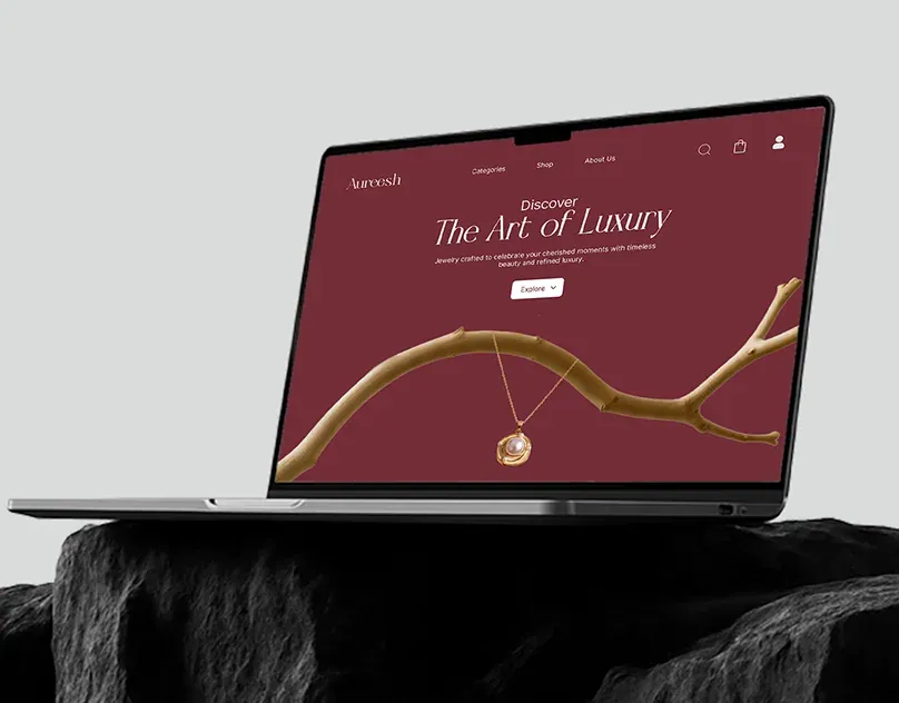
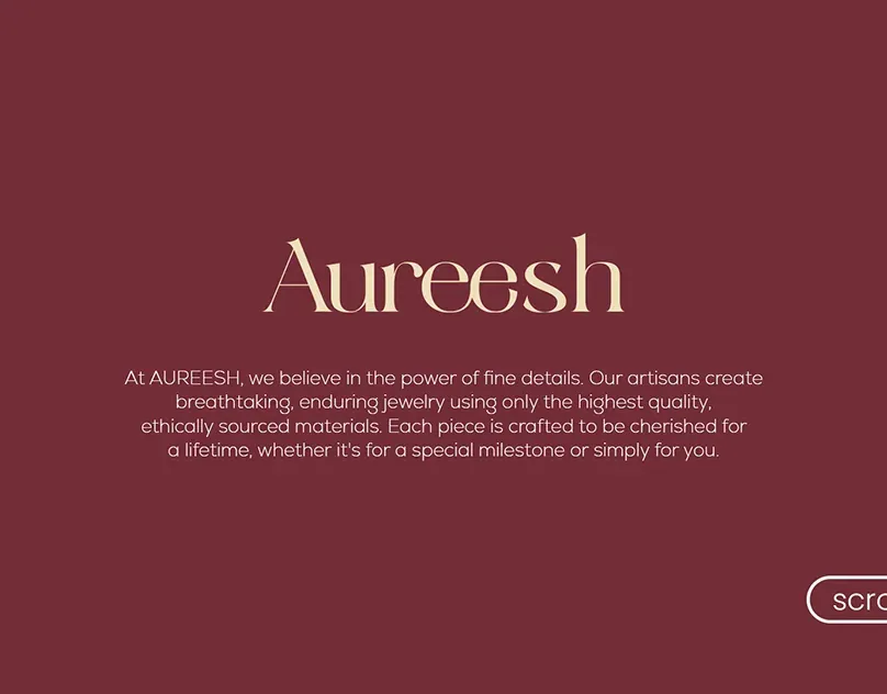
Aureesh is a fine jewelry brand. Jewelry is bought on trust and feeling, so the website had to feel as considered as the pieces: elegant typography, a restrained palette and product storytelling, without getting in the way of browsing and buying.
This was a pro bono client project, designed alongside the Aureesh brand identity.
- Scope
Six pages
A responsive site covering the core shopping journey, including home, product and checkout.
- Scope
Desktop and mobile
Every page designed for both, so the experience holds up on a phone.
- Scope
A system, not just pages
Palette, typography and core UI components defined once and reused.
Design system and components
The brand runs on two colors, deep maroon and warm cream, and a dual-font system: an italic display face for headings against Inter for navigation, body and buttons.
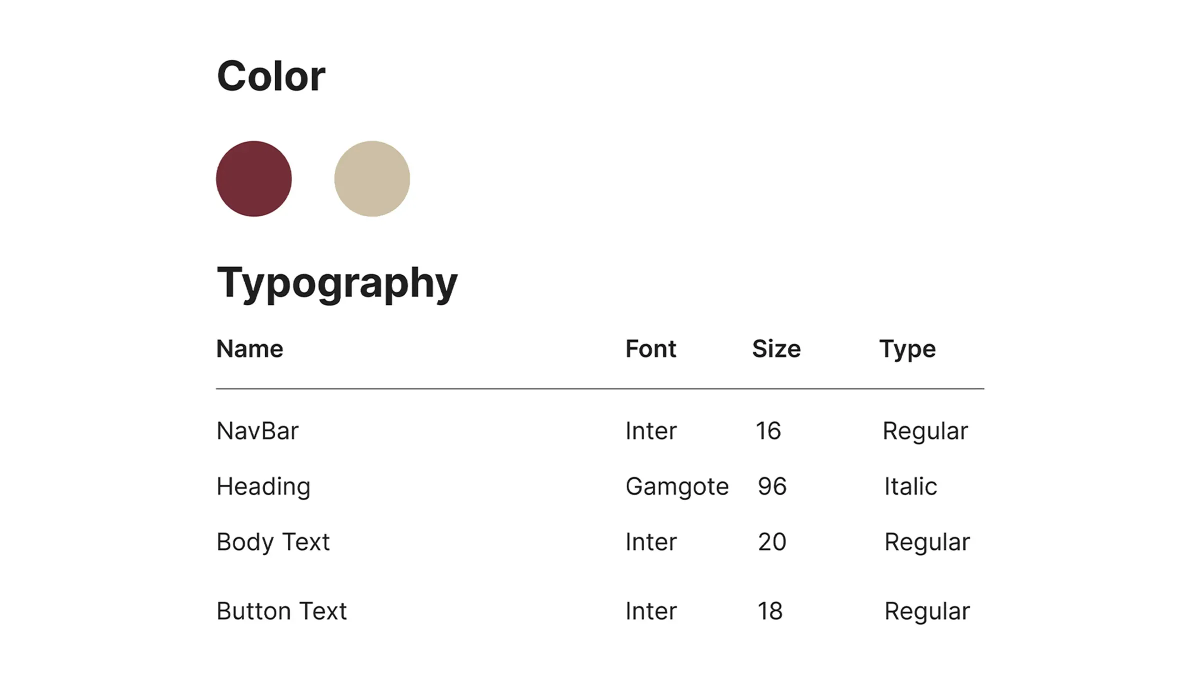
| Use | Font | Size | Style |
|---|---|---|---|
| Navigation | Inter | 16 | Regular |
| Headings | Gamgote | 96 | Italic |
| Body text | Inter | 20 | Regular |
| Buttons | Inter | 18 | Regular |
Final screens
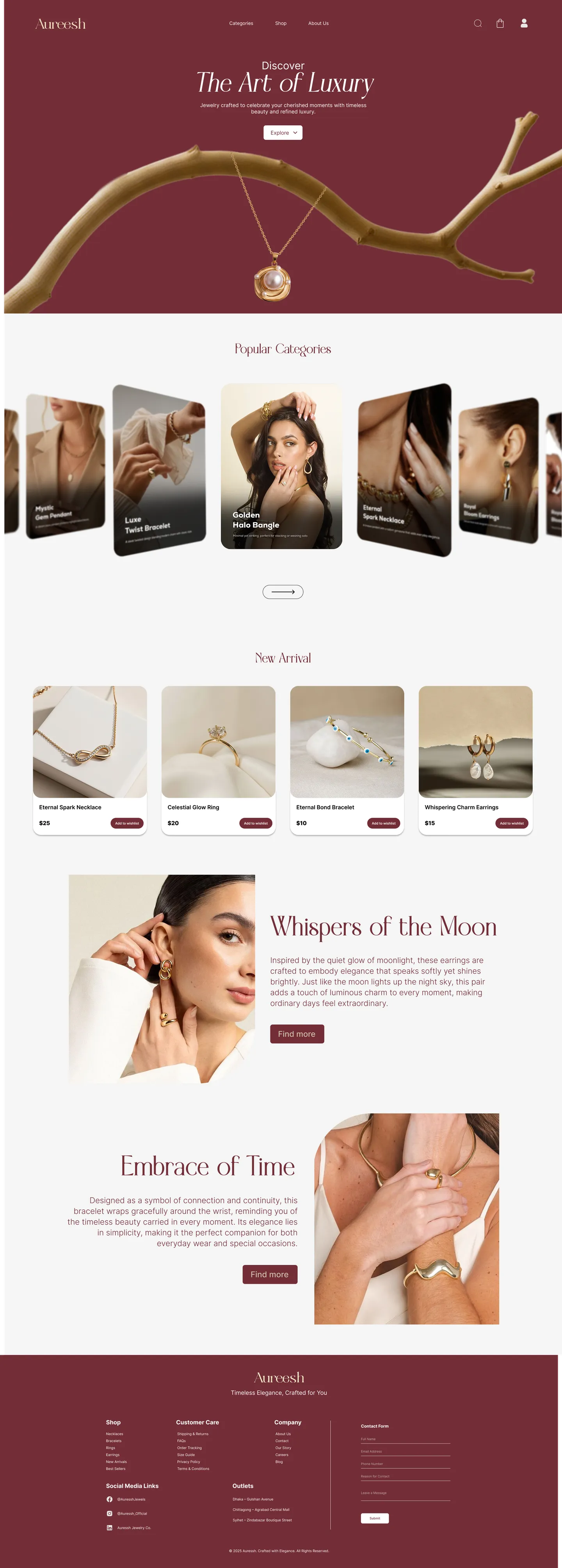
The home page, full length. Hover (or scroll on a phone) to move through it.
Reflection
Aureesh is a small project with a clear lesson: on a luxury site, restraint is the feature. Two colors, two typefaces and generous spacing do most of the work, and the components stay quiet so the jewelry doesn’t have to compete.